focalpoint
Reframing network visibility through intelligent visualisation
We redesigned the NetScaler Management and Analytics System (MAS) to create a clear operational focal point for IT administrators. By bringing together scattered dashboards into organized network visuals (like topology, Sankey, and geomap), we made it easier to quickly check system health, spot problems, and lessen mental load. The new system positioned MAS as a unified control center for network and application performance.
overview
High-level context on the project scope, role, platform, and collaboration model.
Consulting engagement · 6 months · Enterprise network management platform (named under NDA)
Industry: Enterprise Infrastructure / Network Management
Role: UX Designer — Visual Systems & Problem Framing
Platform: NetScaler Management and Analytics System (MAS)
Primary User: IT Administrator
MAS, or Management and Analytics System, is a centralized platform for monitoring, analytics, and orchestration across scale-out architectures. Despite its technical prowess, the experience lacked a coherent visual system for quickly comprehending network health.

the opportunity
Transform the NetScaler Management and Analytics System (MAS) from a data-heavy dashboard into a decision-making surface, which is a platform that facilitates informed choices based on data analysis.
challenge
What was broken in the original experience, and how it affected both users and operations.
Administrators were responsible for ensuring near 100% application uptime. Their day began with a system-wide health check.
- Had no unified overview of all NetScaler instances
- Surfaced excessive, non-actionable alerts
- Forced reliance on navigation-heavy flows and CLI tools
- Presented dense dashboards without hierarchy
The result: High cognitive load. Slow anomaly detection. Fragmented mental models.
pain points
What was broken in the original experience, and how it affected both users and operations.

No centralized, user-friendly UI for managing NetScaler instances

Dashboards overwhelmed with non-actionable data and noisy notifications.

Inefficient navigation and dependency on command-line tools
my roles
How I led design execution, partnered with teams, and supported change across build stages.
As a Visual UX Designer on this project, my roles were the following:
- For each identified challenge, researched how similar complexity was visualized across enterprise tools, data platforms, and network systems. Synthesized patterns and adapted them to the MAS context rather than replicating trends blindly.
- Created high-fidelity wireframes and interactive prototypes in Sketch to validate structure, hierarchy, and flow. Delivered detailed developer handoffs with specifications for states, transitions, and visual logic to ensure implementation fidelity.
user research
Collaborating with research partners to uncover root problems and validate early hypotheses.
Two researchers led discovery through stakeholder interviews with NetOps admins and SREs at enterprise customers, plus competitive teardowns of existing monitoring tools (Datadog, SolarWinds, the incumbent's own predecessor). My role was synthesis-side—taking research signals and translating them into visual problem statements for the team to design against.
solutions
An overview of the redesigned interface and what workflows it simplified.
To help administrators quickly understand the health of complex network environments, we explored three visualization approaches. Each concept focused on making large volumes of system data easier to scan and act on.
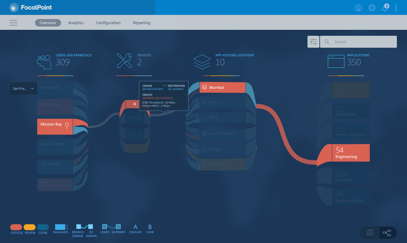
Sankey maps
Inspired by transportation systems and highways, Sankey diagrams visualized relationships and traffic flow between applications, services, and infrastructure nodes. The thickness of connectors represented traffic volume and dependencies.
Best for : Understanding dependencies and bottlenecks
Key Tradeoff: Directional flows between systems reduced readability at enterprise scale


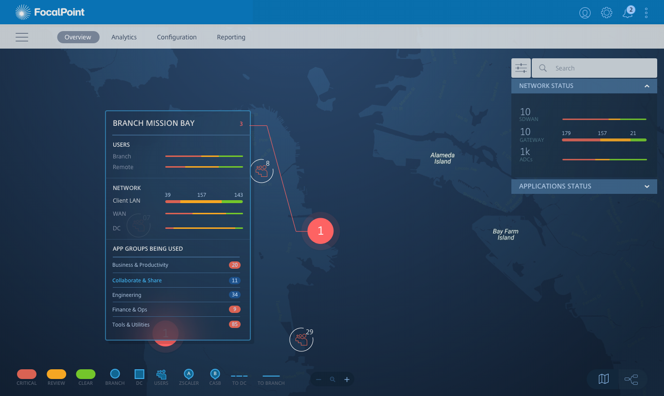
Geo maps
Geomaps introduced a world-view approach to infrastructure monitoring. The experience began with a global map displaying active network regions and issue markers, allowing administrators to immediately identify where incidents were occurring.
Best for :Zooming from global overview into regional systems
Key Tradeoff: Weaker visibility into system relationships
Topology maps
Topology diagrams focused on structural visibility by mapping how infrastructure components were connected. This approach prioritized exploration, drill-down interactions, and layered system understanding.
Best for: Deep infrastructure analysis
Key Tradeoff:Higher interaction complexity

visual process
For every challenge identified, researched how similar complexity was visualized across enterprise tools, data platforms and network systems. Synthesised patterns and adapted them to the MAS context rather than blindly replicating trends.


visual experience

In operator interfaces, the visualization choice isn't really about visualization. It’s about where you want the user to first land in the system and what questions you want them to be able to ask without clicking. The correct default was the one that made the incident surface itself. A combination of Sankey maps and geo maps helps network admins pinpoint the source of an outage.
two views
Blend into one delightful experience.

I spent the first month trying to make all three visualizations equally strong, as if the decision would come down to taste. It didn't. The decision ultimately hinged on a single structural question: at what altitude does a problem first become visible? Once we framed it that way, two of the three concepts answered the question well and one didn't. I should have surfaced that question in week two, not week eight.
learnings & reflections
This project reinforced a core principle: in enterprise systems, clarity is leverage.
Designing network visualizations is not about aesthetics. It is about helping experts orient themselves in seconds. The focal point is not a visual flourish. It is a cognitive anchor.
Selected Works